
Last Updated on September 1, 2026
As we get into the later months of the year, everyone’s favorite season is finally here. Autumn is finally upon us. And as the seasons change, our wardrobe must change as well. It’s time to trade in bright colors and take a more classic approach by following the soft autumn color palette.
The soft autumn color palette is built on muted, warm, low-contrast shades. Think of a color that has had a spoonful of grey stirred into it. Nothing shouts. Everything sits back.
Embrace the fashion trends and seasonal wear that embody the soft autumn palette, enhancing your wardrobe with rich, earthy tones that exude coziness and style for the season. Discover how to integrate these hues seamlessly into your daily outfits.
Here is why that matters this year. Fall 2026 has handed soft autumns an unusually good season. Moss green, espresso brown, toffee, plum and bordeaux are all over the racks right now, and every one of them lives in the muted zone this palette calls for. You are not fighting the trend cycle for once. You are shopping straight through it.
The Soft Autumn Color Palette Is About Shade, Not Color
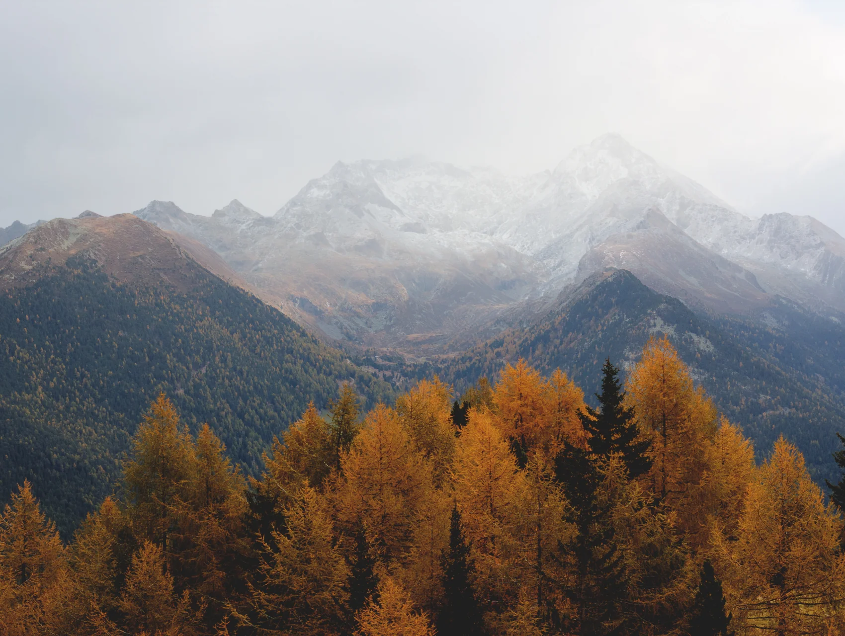
When you think of autumn, what colors come to mind? Maybe reds, greens, yellows, or browns? These are very common fall colors, but what type of red, yellow, or brown? Autumn is not usually associated with extremely bright green or highlighter yellow. So when you set out to create that perfect soft autumn color palette, remember that it’s less about which colors and more about the shade.
Now, what do we mean by shade? Well, every shade of every color falls somewhere on two different lines. The line between dark and light (think of this as a horizontal line) and then a line between bright and muted (think of this as a vertical line). Where these two lines intersect is the “true color.” For example, red on the dark and light lines would look like a maroon on the left, red in the middle, and a light or pastel red on the right.
So why is this important? Well, the perfect soft autumn color palette falls across the entire horizontal dark and light line, but it’s only on the underside of the vertical line, or in the muted area. That means colors can be light or dark, but making sure you have muted colors is what really will make you shine this autumn.
Colors
Now that we know what shades to look for, what colors fit into the seasonal color palette? It’s time for a color analysis. We recommend natural colors or hues you commonly see in nature during autumn. We’re talking browns, greens, yellows, reds, blues, grays, and whites. Once you have your color selected, you can select your ideal shade from there.
Another thing we recommend keeping in mind is warmth. Different colors can be described as warm or cool tones. Warm tones are usually favorable in the cooler seasons, such as autumn. When looking for pieces with mixed colors that are light brown or medium brown, yellow, red, orange, or white, choosing a warmer tone will help you match your look to the autumn atmosphere. However, keep in mind this may not work for all colors, as colors like blue and green are inherently cool-toned.
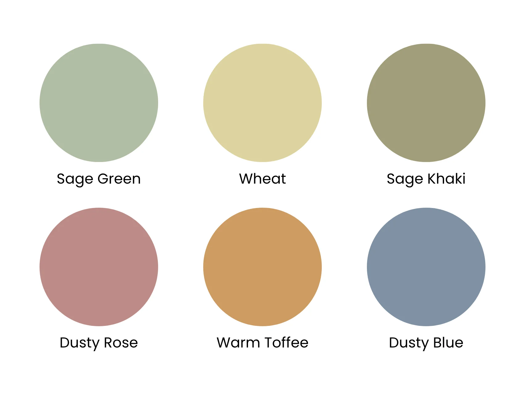
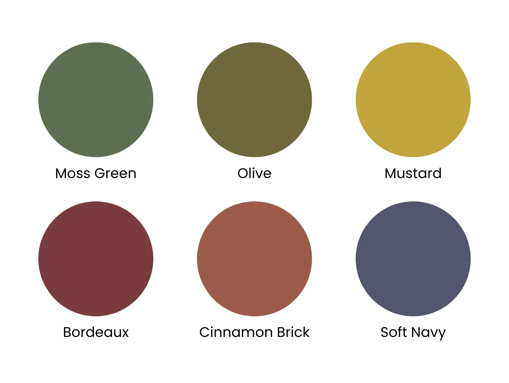
We now know in words which colors, shades, and tones are perfect for autumn, but it can be hard to visualize all that in your mind. But don’t worry. We have created some examples of colors to include in your soft autumn color palette.
Lighter Muted Shades
Darker Muted Shades
Neutrals
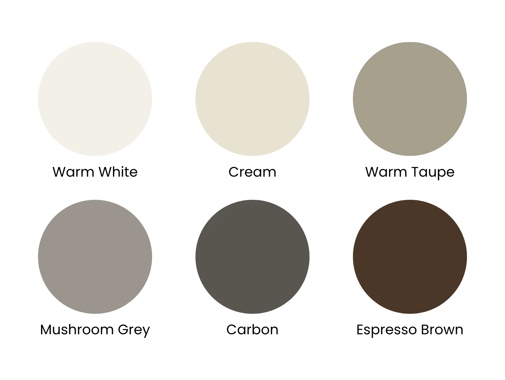
Do keep in mind that these are not all autumn colors; rather, they’re just some examples of a choice of color.
Fall 2026 Trend Colors That Fit the Soft Autumn Color Palette
Most seasons you have to translate a trend before you can wear it. Not this one. Four of this year’s biggest shades land inside the muted range already.
Moss green. The muted, greyed-down green that has quietly replaced the warmer olive of past seasons. It is showing up on cardigans, trousers, and flats, and it behaves like a neutral once you own one piece. This is the single most soft-autumn-friendly color of the season.
Espresso and chocolate brown. Deep, warm, and about as easy to wear as black. Available in everything right now: blazers, wide-leg jeans, boots, andth bags.
Toffee and caramel. The lighter, golden end of the same family. Works as your light neutral instead of stark white, which tends to overpower a soft autumn.
Plum and bordeaux. The moodier reds. Where a bright red would fight your coloring, a deep bordeaux gives you the same impact without the glare. It also pairs with cream and chocolate brown better than a true red does.
Mustard yellow. Warmer and duller than the butter yellow of last year, which makes it wearable here. Use it in small doses if bright colors make you uneasy.
The trend colors to skip
Not everything trending this fall belongs on you. Bubblegum pink, magenta, aqua blue and tomato red are all high-saturation shades. On a soft autumn they do the same thing a camera flash does, which is wash out the face and pull attention to the fabric instead of you. If you love one of them, keep it below the waist or in a bag.
Wardrobe Guide
So we have discussed the types of colors, shades, and tones in the soft autumn color palette. Now let’s take a look at some outfits and makeup looks that utilize these colors along with why they work.
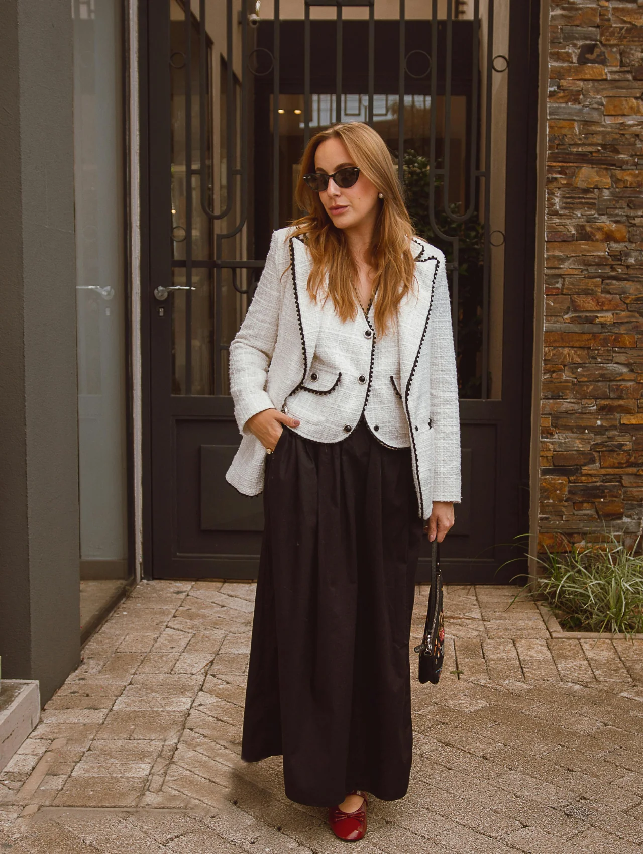
Start with the easiest combination in the palette: cream against warm brown. The trench in this look is toffee, one of the shades in every store right now, and the sweater sits just light enough to read as a contrast without breaking the low-contrast rule.

Get the look: cream and toffee
- Rag & Bone Rue Cotton Trench in Brown
- Stud Low Rise Baggy Jeans
- Crew Neck Long Sleeve Top
- Wide Fit Slouchy Kitten Heel Boots
The green in this second look has a name this season: moss. Muted, slightly grey, nothing like the bright kelly green that turns up every spring. Pair it with brown, and you have the outfit you will reach for on a Tuesday morning school run and again for dinner that night without changing.
This is the one you will reach for on a Tuesday morning and again for dinner that night without changing.
Get the look: moss green and brown
The third look proves that soft autumn does not mean beige forever. A deep green jacket over warm neutrals holds up for an office day or a travel day, and it is the easiest place to swap in this season’s bordeaux if green is not your color. It holds up for an office day and a travel day equally well.
Get the look: bordeaux and warm neutrals
Conclusion
There are so many different ways you can mix and match different colors and shades to achieve the ultimate fall look. A little secret: these tips don’t just apply to clothes! You can apply these tips and use these colors in accessories like bags, jewelry, or even in your makeup looks! No matter how you plan to wear the soft autumn color palette, we hope to have provided you with some seriously awesome tips and inspiration.

Warm Sweaters for Women: Our Top 10 Convenient Picks this Fall
Another summer has come and…
Studded Clothing is Back! Discover How to Rock This Bold Trend and Elevate Your Style Instantly | 2026
There’s an old saying that…
The Essential 9 Fall Clothing Items That You Must Have in Your Wardrobe
Fall clothing is the reason…
The Best 9 Chunky Turtle Neck Sweater to Have in Your Wardrobe This Fall
Colder days are approaching quickly,…
What color palette is best for soft Autumn?
The most favorable colors are soothing and strike a balance between cool and warm tones, from neutrals like beige and nude to vibrant purple and orange or pastel lilac.
Is navy a good color for soft Autumn?
It includes a few versions of navy for Deep Autumns and Soft Autumns because they are neutral.
Am I soft or true Autumn?
Among the three palettes, True Autumn stands out as the warmest, while Dark Autumns have the capacity to embrace deeper and richer colors. In contrast, Soft Autumn’s palette leans toward muted tones rather than bold richness. Both Dark and Soft Autumns exhibit less warmth in their undertones compared to True Autumns.

Lisa Joy is a highly respected fashion expert, style strategist, and trend forecaster with over 15 years of experience in the global fashion industry. Known for her keen eye for detail and deep understanding of fashion history, Lisa has worked with top designers, luxury brands, and leading fashion publications to shape style narratives that inspire. Her expertise spans runway trends, personal styling, sustainable fashion, and brand image consulting.
She holds a degree in Fashion Merchandising and has been featured in renowned outlets such as Vogue, Harper’s Bazaar, and Elle, sharing insights on seasonal trends, wardrobe curation, and the art of personal branding through style. Lisa’s work blends creativity with market awareness, making her a sought-after consultant for emerging designers and established brands alike.
Passionate about empowering individuals to express themselves through fashion, Lisa believes style should be both timeless and adaptable. On this blog, she shares expert tips, industry analysis, and fashion-forward inspiration to help readers stay ahead of trends while building a wardrobe that truly reflects their personality.
Follow Lisa Joy for insider advice, styling secrets, and the latest in fashion trends, from streetwear essentials to luxury couture.